Over the past two days in Honors Environmental Science, we watched a PBS documentary on world population and the changes it currently undergoes. This documentary was nothing short of eye-opening; I was shocked to discover just how fast the world population is increasing. I was also amazed by the fact that birthrates in developed countries are dropping and population sizes are decreasing dramatically. It is projected that Europe’s population will drop by approximately sixty percent over the next fifty years and Russia’s population by twenty percent. In addition, Japan is experiencing a crisis; there are a large amount of elderly citizens and smaller amount of younger citizens. This is due in part by women not wanting to get married as early in life, to pursue their careers further, not wanting as many children, or not wanting children at all. One scene in the documentary was of a boy in the fifth grade who lived in a rural village; the video went on the explain how the boy was the only one in his class due to the decrease in younger populations and that this was becoming the norm across Japan. Another thing that surprised me was that the United States is the only developed country with a growing population, but this is only due to the million immigrants we take in annually.
To the contrary, developing countries are experiencing massive population growth. India, for example, is split demographically; the northern portion of the country is more impoverished and overcrowded while the southern portion is less crowded with a more educated population. In northern India, the increase of population size leading to water and food shortages. Something else I found interested is that half of the country is below the age of twenty-five. In addition, Kenya and other countries in sub-saharan Africa are also experiencing massive population growth and it is leading to the same types of issues as in India. What's Interesting about Kenya is that the HIV / AIDS epidemic is causing lots of younger people to die at an earlier age. Despite this tragic outcome, the population is still growing significantly. Overall, I really enjoyed this documentary. I found it to be very informative and it made me aware of issues I was previously unaware of.
Showing posts with label population. Show all posts
Showing posts with label population. Show all posts
Thursday, January 21, 2016
Wednesday, January 13, 2016
Human Survivorship Changes Lab
This past week was quite exciting in the big wide world of Honors Environmental Science. We began studying population and population changes. More specifically, we took an in-depth look into human survivorship curves. We most certainly hit the ground running as we completed the “Human Survivorship Changes” lab. The lab required us to break off into small groups and head over to a local graveyard. We were then to collect the ages of one-hundred people: twenty-five men who died before 1900, twenty-five women who died before 1900, twenty-five men who died after 2000, and twenty-five women who died after 2000. After roughly forty minutes of data collection, all of the groups met up and headed back to campus. The following day, we compared our data sets, filled in any missing data, and input said data into a Google Sheets document. We then input a column indicating age at the far left of the document and four additional columns to record the number of people alive at each age for each of the four data sets. We then used the “age” and “number of people alive” columns to make a line chart. With some slight tweaking, we made these line charts into human survivorship curves. All of our data and survivorship curves can be seen below:


People who died before 1900:


Comparison Survivorship Curves:


The survivorship curves I created from my data sets seem to be accurate given the number of ages of death I collected. The more data someone collects - the more accurate their survivorship curve will be. While my data set is on the smaller side, I believe it gives a fair representation of the survivorship curves of men and women during the two time periods. In all four charts, the survivorship curve doesn’t start to decrease until the age reaches a higher number. In the survivorship curves of people who died after 2000, the curves do not start to decrease until an even higher age than those who died prior to 1900. This could be due to a multitude of reasons: advanced medicine, less of a need for hard labor, etc. Overall, I found this lab to be fascinating and I really enjoyed being able to collect my own data. It gave the entire class a glance into scientific research.


People who died before 1900:

People who died after 2000:

Survivorship Curves:


Comparison Survivorship Curves:


The survivorship curves I created from my data sets seem to be accurate given the number of ages of death I collected. The more data someone collects - the more accurate their survivorship curve will be. While my data set is on the smaller side, I believe it gives a fair representation of the survivorship curves of men and women during the two time periods. In all four charts, the survivorship curve doesn’t start to decrease until the age reaches a higher number. In the survivorship curves of people who died after 2000, the curves do not start to decrease until an even higher age than those who died prior to 1900. This could be due to a multitude of reasons: advanced medicine, less of a need for hard labor, etc. Overall, I found this lab to be fascinating and I really enjoyed being able to collect my own data. It gave the entire class a glance into scientific research.
Thursday, January 7, 2016
r Selection, K Selection, and Survivorship Curves
Today in Honors Environmental Science, we learned about population. We started out by going over the ideal ways to increase population size of any given species. We concluded that such species would need to be quick to mature sexually, produce lots of offspring, have shorter gestation periods, and reproduce multiple times throughout their lives.
We then moved into the two types of strategists: r-strategists and K-strategists. r-Strategists are species that live in unstable environments with a significant growth rate among younger organisms. r-Strategists are small organisms, produce lots of offspring, mature early, have short life expectancies, and reproduce more than once during their lives. Common examples are mice or other rodents and insects. K-Strategists, on the other hand, are species that live in stable environments and typically have greater carrying capacity. K-Strategists are larger organisms, produce fewer offspring, are late to maturity, require prolonged parental care, have longer life expectancies, and can also reproduce more than once. Some common examples are humans and elephants.

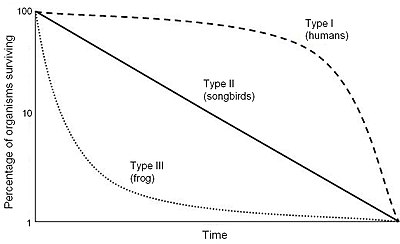
Following this, we learned about the three different types of survivorship curves: Type I, Type II, and Type III. The Type I Survivorship Curve represents K-Strategists and reflects a high, stable number of surviving individuals though younger ages and then starts to decrease as the ages of individuals reach significantly higher numbers. The Type III Survivorship Curve represents r-Strategists and reflect a high number of surviving individual at a young age, but very quickly decreases as the age of individuals increases. The Type II Survivorship Curve lies between Type I and Type III making a gradual decline from a high point at a young age to a low point at an older age. Examples of the three can be seen below:
Towards the end of class, we broke off into groups and completed the “Household Pets and Pests” activity. This required each group to come up of a list of common household pets followed by a list of common household pests. We were then to describe what makes each species attractive to own as a pet or unattractive to experience as a pest. Some common examples for pets were dogs, cats, fish, birds, snakes, rabbits, etc. while some common examples of pests were flies, spiders, cockroaches, mice, ants, stinkbugs, etc. Common themes were that pets were playful, interesting, and enjoyable to be around while pests were a nuisance, annoying, and not enjoyable to be around. After compiling our list, we determined that pets were most likely K-strategists while pests were most likely r-strategists. We also concluded that this was not definite, meaning that not all pets strictly adhere to the K-strategist model and vice versa and that pets, who are mostly K-strategists, accompany humans, who are also K-strategists, while pests, who are mostly r-strategists, serve as a nuisance to humans, who are oppositely K-strategists.

We then moved into the two types of strategists: r-strategists and K-strategists. r-Strategists are species that live in unstable environments with a significant growth rate among younger organisms. r-Strategists are small organisms, produce lots of offspring, mature early, have short life expectancies, and reproduce more than once during their lives. Common examples are mice or other rodents and insects. K-Strategists, on the other hand, are species that live in stable environments and typically have greater carrying capacity. K-Strategists are larger organisms, produce fewer offspring, are late to maturity, require prolonged parental care, have longer life expectancies, and can also reproduce more than once. Some common examples are humans and elephants.
Following this, we learned about the three different types of survivorship curves: Type I, Type II, and Type III. The Type I Survivorship Curve represents K-Strategists and reflects a high, stable number of surviving individuals though younger ages and then starts to decrease as the ages of individuals reach significantly higher numbers. The Type III Survivorship Curve represents r-Strategists and reflect a high number of surviving individual at a young age, but very quickly decreases as the age of individuals increases. The Type II Survivorship Curve lies between Type I and Type III making a gradual decline from a high point at a young age to a low point at an older age. Examples of the three can be seen below:
Towards the end of class, we broke off into groups and completed the “Household Pets and Pests” activity. This required each group to come up of a list of common household pets followed by a list of common household pests. We were then to describe what makes each species attractive to own as a pet or unattractive to experience as a pest. Some common examples for pets were dogs, cats, fish, birds, snakes, rabbits, etc. while some common examples of pests were flies, spiders, cockroaches, mice, ants, stinkbugs, etc. Common themes were that pets were playful, interesting, and enjoyable to be around while pests were a nuisance, annoying, and not enjoyable to be around. After compiling our list, we determined that pets were most likely K-strategists while pests were most likely r-strategists. We also concluded that this was not definite, meaning that not all pets strictly adhere to the K-strategist model and vice versa and that pets, who are mostly K-strategists, accompany humans, who are also K-strategists, while pests, who are mostly r-strategists, serve as a nuisance to humans, who are oppositely K-strategists.
Image Sources:
Image 1: http://www.wildaid.org/sites/default/files/photos/elephants_Peter%20Knights.JPG
Image 2: https://upload.wikimedia.org/wikipedia/commons/thumb/c/c4/Survivorship_Curves.jpg/400px-Survivorship_Curves.jpg
Image 3: https://www.petfinder.com/wp-content/uploads/2012/11/dog-how-to-select-your-new-best-friend-thinkstock99062463.jpg
Subscribe to:
Posts (Atom)