Today in Honors Environmental Science, we learned about population. We started out by going over the ideal ways to increase population size of any given species. We concluded that such species would need to be quick to mature sexually, produce lots of offspring, have shorter gestation periods, and reproduce multiple times throughout their lives.
We then moved into the two types of strategists: r-strategists and K-strategists. r-Strategists are species that live in unstable environments with a significant growth rate among younger organisms. r-Strategists are small organisms, produce lots of offspring, mature early, have short life expectancies, and reproduce more than once during their lives. Common examples are mice or other rodents and insects. K-Strategists, on the other hand, are species that live in stable environments and typically have greater carrying capacity. K-Strategists are larger organisms, produce fewer offspring, are late to maturity, require prolonged parental care, have longer life expectancies, and can also reproduce more than once. Some common examples are humans and elephants.

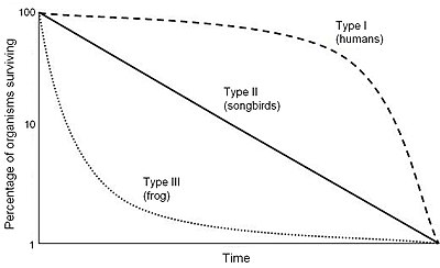
Following this, we learned about the three different types of survivorship curves: Type I, Type II, and Type III. The Type I Survivorship Curve represents K-Strategists and reflects a high, stable number of surviving individuals though younger ages and then starts to decrease as the ages of individuals reach significantly higher numbers. The Type III Survivorship Curve represents r-Strategists and reflect a high number of surviving individual at a young age, but very quickly decreases as the age of individuals increases. The Type II Survivorship Curve lies between Type I and Type III making a gradual decline from a high point at a young age to a low point at an older age. Examples of the three can be seen below:
Towards the end of class, we broke off into groups and completed the “Household Pets and Pests” activity. This required each group to come up of a list of common household pets followed by a list of common household pests. We were then to describe what makes each species attractive to own as a pet or unattractive to experience as a pest. Some common examples for pets were dogs, cats, fish, birds, snakes, rabbits, etc. while some common examples of pests were flies, spiders, cockroaches, mice, ants, stinkbugs, etc. Common themes were that pets were playful, interesting, and enjoyable to be around while pests were a nuisance, annoying, and not enjoyable to be around. After compiling our list, we determined that pets were most likely K-strategists while pests were most likely r-strategists. We also concluded that this was not definite, meaning that not all pets strictly adhere to the K-strategist model and vice versa and that pets, who are mostly K-strategists, accompany humans, who are also K-strategists, while pests, who are mostly r-strategists, serve as a nuisance to humans, who are oppositely K-strategists.

Image Sources:
Image 1: http://www.wildaid.org/sites/default/files/photos/elephants_Peter%20Knights.JPG
Image 2: https://upload.wikimedia.org/wikipedia/commons/thumb/c/c4/Survivorship_Curves.jpg/400px-Survivorship_Curves.jpg
Image 3: https://www.petfinder.com/wp-content/uploads/2012/11/dog-how-to-select-your-new-best-friend-thinkstock99062463.jpg


