I honestly do not know where to start. This year has been incredible. Although we jumped around quite a few times, it all always worked out in the end and I’m able to say I’m leaving the class with a solid grasp on Environmental Science. I love how the class ties into current events such as agriculture along with pesticide usage, extreme weather, etc. For the future, I would perhaps break up each trimester into three or four sections where the class focuses on a current event / issue facing the world today such as a decline in bee population or how extreme weather / rising ocean temperatures will affect coastal cities such as New York and Miami. I also think the class should take more field trips and outdoor walks. Documentaries like Gasland are both entertaining and very informative, incorporating films such as those would be highly beneficial.
As for the video we started watching, it is very, very different, but in a good way. It’s certainly not what I expected from a documentary, but I feel as if the narrator does an excellent job getting his point across to the viewer. He notes the importance of the Earth and its resources without being overly cynical about it. He gets the point about how if we want to survive as a species, we better change our actions in a way that is not overly depressing but still equally pressing. The narrator is a fellow optimist like myself - I like that about him too. There is a lot of work that needs to get done, but we can do it if we all work together. The ned doesn’t need to be in sight. Hopefully the remainder of humanity shares my drive and enthusiasm to make real change.
Thanks for two incredible years, Jon. I’ve loved both Honors Biology and Honors Environmental Science. They were honestly two of my favorite classes ever and I looked forward to them each and every day. Sometimes, I think you second guess your decisions, and while the path the class has taken has been a little choppy at times, I still loved every second of it and I always walked away with a better understanding of the natural world around me. You’re an amazing teacher, Jon - don’t ever forget it (even when you steal all my friends from my free period by creating a new elective with Scott ;) ). You’ve inspired me to pursue the sciences in college, and I owe it all to you and your teaching. The plan is to become a doctor - we’ll see how it goes. I’ll be sure to keep you posted. And if you’re ever headed to the Galapagos again and looking for a travel buddy - I’d be happy to join you. :) Until we meet again…
All the best,
J.R.
P.S. I’ll be working at the Day Camp again this summer, so I’m sure I’ll see you around. I’d also be more than happy to take Happy on a walk every now and then on my breaks from caring for nine-year-olds - just let me know! :)
Thursday, May 12, 2016
Sunday, May 8, 2016
Agriculture Chapter: Sections 1-3 Summary
For our last topic of study of the year, my Honors Environmental Science class is diving into agriculture. Here is a summary of the first three section of our final chapter:
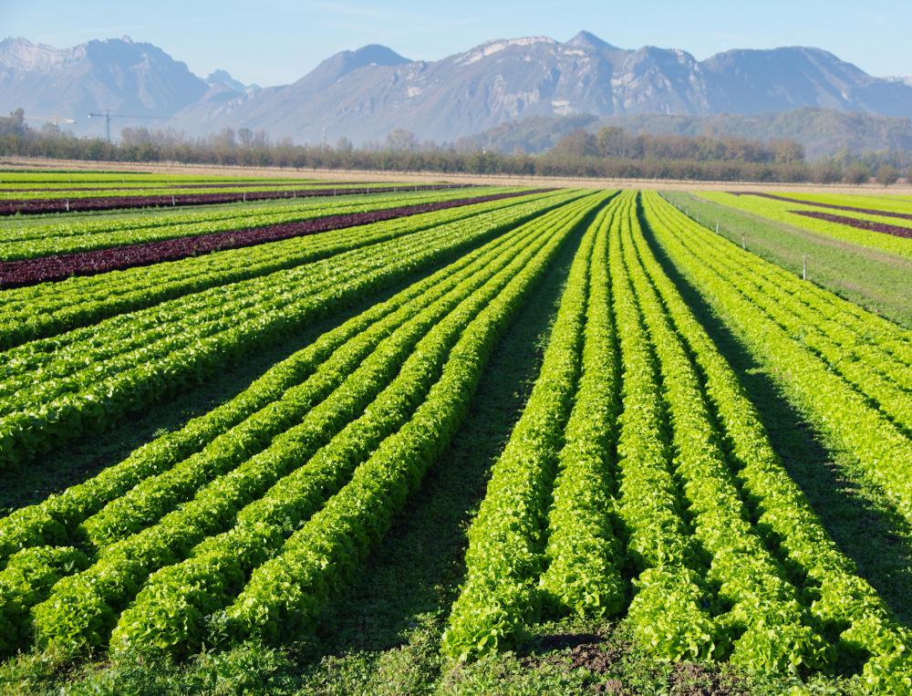
Section 1:
Agriculture is the process in which humans convert natural ecosystems into spaces where they can grow edible biomass for food and energy. Without agriculture, we as humans would not be able to survive. With the growing population of humans, we need a system, such as agriculture, that produces enough food to sustain all of the life on this planet. According to English economist Thomas Robert Malthus in the late eighteenth century, the human population grows exponentially while agriculture does not. Humanity’s solution to this problem was industrial agriculture. While this industrious approach to growing food does produce more edible biomass, it is highly unsustainable and poses a major risk to the environment.
Section 2:
The amount of land that can be used for agriculture on earth’s surface depends on a multitude of factors including temperature, topography, climate, soil quality, and agricultural technologies. Currently, as of the year 2000, approximately 37% of the Earth’s land is used for agriculture. Of that 33%, approximately 11% is used for growing crops and the remaining is used as pasture land (raising animals). Certain areas are better suited for farming than others, however technological advancements have helped to level the playing field.
Section 3:
Photosynthesis is the process by which plants convert sunlight and water into plant tissue. In order to do this, plants require carbon dioxide and water. While carbon dioxide is an essential part of photosynthesis, plants require four-hundred times more water than they do carbon dioxide. Therefor, droughts pose major threats to the survival of plants. In addition, plants also require nitrogen to grow which they receive through the soil. Prior to World War I, the most common type of nitrogen-rich fertilizer was livestock manure, however, synthetic solutions have since replaced manure.
Source: Habitable Planet Textbook
Image Source: http://images.wisegeek.com/escarole-farm.jpg
Thursday, May 5, 2016
Lowest Observable Adverse Effect Level Lab Report
Hello, everyone! These last few weeks in Honors Environmental Science have been quite exciting! We've spent our time in class compelleting this Lowest ObservableAdverse Effect Level lab. See below to find out more!
Lowest Observable Adverse Effect Level Lab Report
Introduction:
The purpose behind this lab is to determine the lowest observable adverse effect level of Mr. Clean brand multi-purpose household cleaner on red winter wheat. This anthropogenic pollutant affects the surrounding ecosystem when released into the environment, our goal is to determine just how much multi-purpose cleaner can be released into a particular ecosystem before an adverse effect becomes noticeable. We hypothesize that Plant B, the plant receiving the 12% solution of Mr. Clean, will display the lowest observable adverse effect level.
Materials:
- 150 hard red winter wheat seeds
- 15 plant pots
- Water
- Soil
- Drip Tray
- Mr. Clean Multi-Purpose Household Cleaner
- 100 mL or Larger Beaker
- 10 mL Graduated Cylinder
- Eye Dropper
- Sticky Notes
- Pen
Procedure:
- Gather all materials. Align the 15 plant pots into three rows of five within the drip tray. In each row, assign a control and then label the remaining plants A - D.
- Pour soil into all 15 plant pots. Fill pots approximately one inch down from the brim.
- Plant red winter wheat ten seeds per pot. Once planted, place plants by a window with adequate sunlight.
- Water each pot once every few days with the corresponding solution of Mr. Clean Multi-Purpose Cleaner and water.
- Each pot will be watered with exactly 50 mL of tap water. The control pot will be watered with pure tap water only. Plants A-D will be watered with the tap water in addition to a certain amount of Mr. Clean. See directed amounts. Only water when soil is mostly dry. If soil is damp, refrain from watering.
- Control = 50 mL water only
- Plant A = 50 mL water + 3 mL Mr. Clean (6% of 50 mL)
- Plant B = 50 mL water + 6 mL Mr. Clean (12% of 50 mL)
- Plant C = 50 mL water + 9 mL Mr. Clean (18% of 50 mL)
- Plant D = 50 mL water + 12 mL Mr. Clean (24 % of 50 mL)
- Record data day by day. Note the height of the tallest and shortest plant for each plant type (Control, A, etc.). Also make note of plant conditions such as their coloring and the dampness of the soil. Record for approximately two weeks.
Results:
In our experiment, we discovered that the lowest observable adverse effect level lies somewhere between 18% and 24%. Plant D, the plant receiving the 24% solution, was the first to show adverse effects. The Plant D plants were relatively shorter compared to the others. In our observations, it was quite clear visually that Plant D plants were smaller in size and fewer had sprouted overall. Therefore, our hypothesis is incorrect.


Discussion:
While we believe our results to be accurate, if we were to complete this experiment a second time, we would change the way we measure the pants. In lieu of focussing on the extremes (tallest and shortest), we would measure all of the plants in each pot of each trial and calculate the average height. We would then use the average height of each plant type to determine the lowest observable adverse effect level.
Literature Cited:
Wagner, Travis, and Robert M. Sanford. "Experimental Design: Environmental Contamination." Environmental Science: Active Learning Laboratories and Applied Problem Sets. Hoboken, NJ: John Wiley & Sons, 2010. N. pag. Print.
Monday, April 25, 2016
Scientific American & LOAEL Reflection


These toxins are contaminating our water supply, polluting the air we breathe, and shortening the lifespan of countless people. Those less-fortunate are affected by this crisis to an even further extent. In developing countries, some people have no choice but to work in mines with very little protection and face all the saddening consequences. This even occurs in the United States. It was recently discovered that the water supply of Flint, Michigan, a lower-income community, was contaminated with lead. The severity of the effect this had on flint residences is still not entirely known. Overall, this article was quite fascinating, yet simultaneously depressing. We need to change the way we do things if we’re serious about saving this planet we call home.
Image 1: http://www.healthjournalism.org/blog/wp-content/uploads/2009/09/mercury.jpg
Image 2: http://www.newyorker.com/wp-content/uploads/2016/01/Osnos-Crisis-in-Flint-Goes-Deeper-Than-the-Water-1200.jpg
Saturday, April 16, 2016
Energy Ad Project Reflection

Overall, I found this project to be quite enjoyable. WeVideo has greatly improved since last year and the ad concept was a fun idea. Felix and I liked researching wind energy, its pros/cons, and creating the ads. I also like to divide and conquer approach - where the class is split up and each group researches one particular area and then we share what we found in the end. This method is much less daunting and an exciting way to learn. This project opened my eyes to all the various energy options in the world. The only thing I would change is the time constraint; I think it would be nicer to make the ads a bit longer in order to further explain our reasoning and dig deeper into the project.
Image: http://powidian.com/wp-content/uploads/2015/04/beautiful-wind-turbines-at-night-wide.jpg
Wednesday, March 30, 2016
Hydraulic Fracturing (Fracking) Infographic
Hello, everyone!
Over the past week and a half, my Honors Environmental Science has been talking about energy and energy usage. To complement this unit, the entire class individually researched hydraulic fracturing (fracking) and created an infographic to display said research. Below is my infographic- enjoy!
One thing I did not mention in this infographic was my personal opinion on the fracking issue. Personally, I do not support the practice. I believe the risks greatly outnumber the benefits. A clean and healthy water supply is far more important than energy stability and security. I believe we should invest more money into cleaner, alternative energy sources in lieu of natural gas extraction.

Wednesday, March 23, 2016
Energy Consumption Reading Questions Part II
What are some ways that electricity can be used? (209)
Electricity can be used to power lights, operate electronic devices such as televisions, and even to charge electric cars to name a few examples. Electricity is essential to our everyday life in the modern world.

Hydrogen fuel cells can be used to replace batteries such as those in cell phones, laptops, or electric cars.


Electricity can be used to power lights, operate electronic devices such as televisions, and even to charge electric cars to name a few examples. Electricity is essential to our everyday life in the modern world.
What are some uses for hydrogen fuel cells? (209)
Hydrogen fuel cells can be used to replace batteries such as those in cell phones, laptops, or electric cars.
What are some pros and cons of storing energy as hydrogen? In batteries? In flywheels? (209)
Hydrogen can be used to store chemical energy. Batteries are the most common source of energy storage and can range in size to power anything from a watch or hearing aid to a car or even parts of a power plant. Flywheels are used in electric motors to capture kinetic energy. While all of these sources have their own pros, one major con is that all of three of these sources are not 100% efficient. Each time energy is transfered, some energy is lost in the process.
How do policy decisions affect the development of energy technologies? (210)
Policy can affect the development of energy technologies by determining how much time, research, and money goes into the development process. Policy can have both positive and negative effects on development, all depending on what type of policy is being passed. Some policies may favor research in alternative sources of energy such as wind or solar while others may do just the opposite.
Image 1: http://investingreenenergy.com/wp-content/uploads/2011/08/off-grid-lighting-technology-home.jpg
Image 2: http://images.anandtech.com/doci/7324/5battery_678x452.jpg
Image 3: https://grist.files.wordpress.com/2013/04/solar-panels-homepage.jpg
Tuesday, March 22, 2016
Energy Consumption Reading Questions
How does the concentration of energy in a source affect how people can use energy? (198)
The concentration of energy in a source determines how much energy people can extract from said source. For example, if a particular source has a high concentration of energy, then it will produce more energy than another source with a lower concentration.
How do the United States, China, and Kenya compare in total energy consumption? In per capita energy consumption? (198)
In 2008, the United States consumed one-hundred and five billion gigajoules of energy (22% of the global total), China consumed ninety billion gigajoules of energy (17% of the global total), and Kenya consumed twenty-two million gigajoules (0.04% of the global total). The United States consumes the most energy per capita at approximately fifty-six gigajoules per person per year. That’s roughly six times the amount consumed by the average person living in China and sixty times the amount consumed by the average person in Kenya.

How can the same energy service be provided with less energy for lighting? For transportation? (205)
The same energy service can be provided with less energy for lighting by using more-efficient light bulbs such as CFLs or LEDs in lieu of incandescents. Likewise, in terms of transportation, less energy can be used by operating more efficient vehicles with either better gas mileage or driving hybrids.
When does conservation reduce quality of life? Improve quality of life? (205)
Conservation can reduce quality of life when buildings lower their temperature in colder weather and raise their temperature in warmer weather in an attempt to conserve energy; one can argue it makes those who inhabit the building uncomfortable. Conservation can be enjoyable when participating in carpools, driving more-efficient vehicles, or living in energy-efficient homes.

Image 1: http://www.hoax-slayer.com/images/mobile-phone-death-boy-px.jpg
Image 2: http://green-mom.com/wp-content/uploads/2013/11/led-lights1.gif
Image 3: https://www.brown.edu/about/administration/transportation/sites/brown.edu.about.administration.transportation/files/images/carpool.jpg
The concentration of energy in a source determines how much energy people can extract from said source. For example, if a particular source has a high concentration of energy, then it will produce more energy than another source with a lower concentration.
How do the United States, China, and Kenya compare in total energy consumption? In per capita energy consumption? (198)
In 2008, the United States consumed one-hundred and five billion gigajoules of energy (22% of the global total), China consumed ninety billion gigajoules of energy (17% of the global total), and Kenya consumed twenty-two million gigajoules (0.04% of the global total). The United States consumes the most energy per capita at approximately fifty-six gigajoules per person per year. That’s roughly six times the amount consumed by the average person living in China and sixty times the amount consumed by the average person in Kenya.
How can the same energy service be provided with less energy for lighting? For transportation? (205)
The same energy service can be provided with less energy for lighting by using more-efficient light bulbs such as CFLs or LEDs in lieu of incandescents. Likewise, in terms of transportation, less energy can be used by operating more efficient vehicles with either better gas mileage or driving hybrids.
When does conservation reduce quality of life? Improve quality of life? (205)
Conservation can reduce quality of life when buildings lower their temperature in colder weather and raise their temperature in warmer weather in an attempt to conserve energy; one can argue it makes those who inhabit the building uncomfortable. Conservation can be enjoyable when participating in carpools, driving more-efficient vehicles, or living in energy-efficient homes.
Image 1: http://www.hoax-slayer.com/images/mobile-phone-death-boy-px.jpg
Image 2: http://green-mom.com/wp-content/uploads/2013/11/led-lights1.gif
Image 3: https://www.brown.edu/about/administration/transportation/sites/brown.edu.about.administration.transportation/files/images/carpool.jpg
Monday, February 29, 2016
Independent Research Project
Over the past few weeks, my classmates and I finished the trimester of Honors Environmental Science by completing an independent research project. For this project, we were able to research any topic of our choosing relating to environmental science. As a lover of the environmental and the co-president of Solebury Environmental Action Committee (S.E.A.C.), I decided to research biodiversity, its importance, and the threats it faces. Check out the website I created to learn more!

Image Source: http://thumbs.dreamstime.com/z/animals-biodiversity-28900966.jpg
Sunday, January 31, 2016
Dialogue Assignment

“I understand your concern,” said Alessandro, “but I came across some startling information! Did you know that incandescents actually release mercury into the environment too? In fact, 100W incandescent bulbs, some of the most common, release approximately sixteen milligrams of mercury into the environment over the course of their lifespan. Incandescents require more energy than CFLs and therefore power plants need to produce more energy, so more fossil fuels are burned and more mercury is released. This is compared to 23W CFLs, some of the most common fluorescent bulbs, that only release eight milligrams of mercury into the environment over their lifespan.”
“Interesting,” Carmela explained, “I didn’t know that? I guess incandescents harm the environment even more than CFLs. But what about if someone drops a CFL bulb in their home? Wouldn’t that harm them? People could get hurt. Incandescents don’t contain any mercury.”
“Very true,” said Alessandro, “But if we’re extra careful with them, CFLs are the better choice for the environment. We’ll work hard to make sure this one gets recycled after it dies out, but even if it’s not, it will still release less mercury into the environment than an incandescent.”
“That’s a good point,” said Carmela, “we’ll just have to be extra careful with them.”
Before Carmela could finish her thought, Judy interjected, “Wow, Alessandro! I didn’t know that either! Good to know. But don’t CFLs have a shorter lifespan when you turn them on and off frequently? Won’t we just have to buy them more often? And they’re more expensive than incandescents - this TreeHouse is on a budget.”
“I completely understand your concern, Judy,” said Alessandro, “but I’ve also come across research that tested the lifespan of CFLs when used with shorter operation cycle times. The study started with three hour cycles being the cycle time that gives the bulbs the longest lifespan. When the average cycle time was reduced from three hours to one hour, the fluorescent bulb lasted eighty-percent of its projected lifespan. When the average cycle was reduced to fifteen minutes, the bulb lasted only thirty percent of its projected lifespan. When the average cycle was reduced to five minutes, the bulb only lasted fifteen percent of its project lifespan.”
Judy exclaimed, “See?! I told you incandescents were the better choice for our budget. If we keep buying these things for the TreeHouse, we’ll just blow through all of our money. Is it really worth it?”
“It depends,” said Alessandro, “If everyone in the TreeHouse can agree to only turn the lights on when they absolutely need to and not only for a few minutes here and there, the CFLs are the better choice for our wallets and the environment. If used correctly, CFLs can last ten times longer than incandescent bulbs.”
“But what if people are irresponsible with turning the lights on and off ? Not everyone is as careful as the three of us you know? We’d need to buy new CFL bulbs just as often as we already need to with the incandescents, and incandescents are much less expensive,” explained Judy.
“That’s an excellent point,” said Alessandro, “But CFLs require four times less energy than incandescents. Even if people in the TreeHouse lessen the lifespan of the CFL, the amount of energy we will save on our electric bill will greatly outweigh the cost of the bulbs.”
“Good point,” said Judy, “I didn’t really think about that.”
“Wow,” Carmela exclaimed, “You really did your research, Alessandro! I’m impressed. I think CFLs are the winner here - hands down. We just need to be extra careful so they don’t break and leak mercury in the TreeHouse. We should also make posters for around campus instructing people to recycle their CFLs instead of just throwing them away.”
“I agree,” said Judy, “CFLs are the best pick after all! If we can use them responsibly, this TreeHouse will be in great shape.”
“I’m glad we can all agree,” said Alessandro, “Now let’s go eat some bagels!”
Information Source: Ramroth, Laurie. "Comparison of Life-Cycle Analyses of Compact Fluorescent and Incandescent Lamps Based on Rated Life of Compact Fluorescent Lamp." Rocky Mountain Institute. Feb. 2008. Web.
Story Line Modeled After: Boose, David L. "A Green Light for CFLs?" Gonzaga University. Biology Department. Print.
Image: http://hhomedesign.com/wp-content/uploads/2015/03/Designer-Treehouses.jpg
Thursday, January 21, 2016
World Population Video Reflection
Over the past two days in Honors Environmental Science, we watched a PBS documentary on world population and the changes it currently undergoes. This documentary was nothing short of eye-opening; I was shocked to discover just how fast the world population is increasing. I was also amazed by the fact that birthrates in developed countries are dropping and population sizes are decreasing dramatically. It is projected that Europe’s population will drop by approximately sixty percent over the next fifty years and Russia’s population by twenty percent. In addition, Japan is experiencing a crisis; there are a large amount of elderly citizens and smaller amount of younger citizens. This is due in part by women not wanting to get married as early in life, to pursue their careers further, not wanting as many children, or not wanting children at all. One scene in the documentary was of a boy in the fifth grade who lived in a rural village; the video went on the explain how the boy was the only one in his class due to the decrease in younger populations and that this was becoming the norm across Japan. Another thing that surprised me was that the United States is the only developed country with a growing population, but this is only due to the million immigrants we take in annually.
To the contrary, developing countries are experiencing massive population growth. India, for example, is split demographically; the northern portion of the country is more impoverished and overcrowded while the southern portion is less crowded with a more educated population. In northern India, the increase of population size leading to water and food shortages. Something else I found interested is that half of the country is below the age of twenty-five. In addition, Kenya and other countries in sub-saharan Africa are also experiencing massive population growth and it is leading to the same types of issues as in India. What's Interesting about Kenya is that the HIV / AIDS epidemic is causing lots of younger people to die at an earlier age. Despite this tragic outcome, the population is still growing significantly. Overall, I really enjoyed this documentary. I found it to be very informative and it made me aware of issues I was previously unaware of.
To the contrary, developing countries are experiencing massive population growth. India, for example, is split demographically; the northern portion of the country is more impoverished and overcrowded while the southern portion is less crowded with a more educated population. In northern India, the increase of population size leading to water and food shortages. Something else I found interested is that half of the country is below the age of twenty-five. In addition, Kenya and other countries in sub-saharan Africa are also experiencing massive population growth and it is leading to the same types of issues as in India. What's Interesting about Kenya is that the HIV / AIDS epidemic is causing lots of younger people to die at an earlier age. Despite this tragic outcome, the population is still growing significantly. Overall, I really enjoyed this documentary. I found it to be very informative and it made me aware of issues I was previously unaware of.
Sunday, January 17, 2016
A Look Back
Looking back on the Winter Trimester thus far, we have covered a lot of material in Honors Environmental Science. With almost every topic we cover, a blog post is soon to follow. This blog represents my progress in the class; it is a way to track just how much I have learned and how well I understand the material covered. After all, the best way to know if you understand something is to teach it to others.
Without a doubt, the blog post I deem to be my best is my “r Selection, K Selection, and Survivorship Curves” post. In this post, I felt I did an excellent job describing the in-class activity and what it meant to me. Not only was I able to describe what we did in class, but why it mattered as well. I believe I did this well in my other posts too, but I feel as if I mastered it in this one. I was clear and concise, yet I did not leave out any important information or explanations. In addition, I added several meaningful and effective visual aids to break away from one giant wall of text. The pictures I chose serve as a supplement to the material I discussed in the post. Together, my concise yet effective wording combined with my meaningful choice of pictures made this blog post one of my best works thus far.
The one blog post that needs improvement is my “Human Survivorship Changes” lab. I do not believe it is the content that needs improving here - I think I was able to capture the importance of the lab in my analysis. Instead, it’s the visual aids I used as supplements. I didn’t quite realize what I did until meeting with my teacher in the following class. He explained how my post was good by all means, but that it could be better. He pointed out the screenshots of the data and graphs I made and went on to explain how they were good, but could be even more meaningful. I could enlarge the images, make comparison graphs of the data, and a few other tweaks to make the post its absolute best. I completely agree with him; the data is there, it can just be presented in a more effective, more meaningful way. I will most certainly be making adjustments to that post in the near future.
Overall, this class has been super great. I look forward to see what comes out of the remainder of the year. If it's anything like the first half, I know it'll be equally as amazing.
Wednesday, January 13, 2016
Human Survivorship Changes Lab
This past week was quite exciting in the big wide world of Honors Environmental Science. We began studying population and population changes. More specifically, we took an in-depth look into human survivorship curves. We most certainly hit the ground running as we completed the “Human Survivorship Changes” lab. The lab required us to break off into small groups and head over to a local graveyard. We were then to collect the ages of one-hundred people: twenty-five men who died before 1900, twenty-five women who died before 1900, twenty-five men who died after 2000, and twenty-five women who died after 2000. After roughly forty minutes of data collection, all of the groups met up and headed back to campus. The following day, we compared our data sets, filled in any missing data, and input said data into a Google Sheets document. We then input a column indicating age at the far left of the document and four additional columns to record the number of people alive at each age for each of the four data sets. We then used the “age” and “number of people alive” columns to make a line chart. With some slight tweaking, we made these line charts into human survivorship curves. All of our data and survivorship curves can be seen below:


People who died before 1900:


Comparison Survivorship Curves:


The survivorship curves I created from my data sets seem to be accurate given the number of ages of death I collected. The more data someone collects - the more accurate their survivorship curve will be. While my data set is on the smaller side, I believe it gives a fair representation of the survivorship curves of men and women during the two time periods. In all four charts, the survivorship curve doesn’t start to decrease until the age reaches a higher number. In the survivorship curves of people who died after 2000, the curves do not start to decrease until an even higher age than those who died prior to 1900. This could be due to a multitude of reasons: advanced medicine, less of a need for hard labor, etc. Overall, I found this lab to be fascinating and I really enjoyed being able to collect my own data. It gave the entire class a glance into scientific research.


People who died before 1900:

People who died after 2000:

Survivorship Curves:


Comparison Survivorship Curves:


The survivorship curves I created from my data sets seem to be accurate given the number of ages of death I collected. The more data someone collects - the more accurate their survivorship curve will be. While my data set is on the smaller side, I believe it gives a fair representation of the survivorship curves of men and women during the two time periods. In all four charts, the survivorship curve doesn’t start to decrease until the age reaches a higher number. In the survivorship curves of people who died after 2000, the curves do not start to decrease until an even higher age than those who died prior to 1900. This could be due to a multitude of reasons: advanced medicine, less of a need for hard labor, etc. Overall, I found this lab to be fascinating and I really enjoyed being able to collect my own data. It gave the entire class a glance into scientific research.
Thursday, January 7, 2016
r Selection, K Selection, and Survivorship Curves
Today in Honors Environmental Science, we learned about population. We started out by going over the ideal ways to increase population size of any given species. We concluded that such species would need to be quick to mature sexually, produce lots of offspring, have shorter gestation periods, and reproduce multiple times throughout their lives.
We then moved into the two types of strategists: r-strategists and K-strategists. r-Strategists are species that live in unstable environments with a significant growth rate among younger organisms. r-Strategists are small organisms, produce lots of offspring, mature early, have short life expectancies, and reproduce more than once during their lives. Common examples are mice or other rodents and insects. K-Strategists, on the other hand, are species that live in stable environments and typically have greater carrying capacity. K-Strategists are larger organisms, produce fewer offspring, are late to maturity, require prolonged parental care, have longer life expectancies, and can also reproduce more than once. Some common examples are humans and elephants.

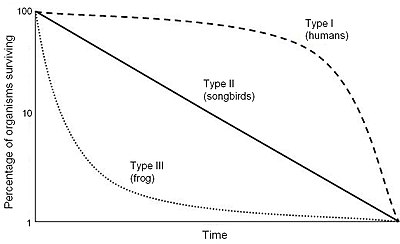
Following this, we learned about the three different types of survivorship curves: Type I, Type II, and Type III. The Type I Survivorship Curve represents K-Strategists and reflects a high, stable number of surviving individuals though younger ages and then starts to decrease as the ages of individuals reach significantly higher numbers. The Type III Survivorship Curve represents r-Strategists and reflect a high number of surviving individual at a young age, but very quickly decreases as the age of individuals increases. The Type II Survivorship Curve lies between Type I and Type III making a gradual decline from a high point at a young age to a low point at an older age. Examples of the three can be seen below:
Towards the end of class, we broke off into groups and completed the “Household Pets and Pests” activity. This required each group to come up of a list of common household pets followed by a list of common household pests. We were then to describe what makes each species attractive to own as a pet or unattractive to experience as a pest. Some common examples for pets were dogs, cats, fish, birds, snakes, rabbits, etc. while some common examples of pests were flies, spiders, cockroaches, mice, ants, stinkbugs, etc. Common themes were that pets were playful, interesting, and enjoyable to be around while pests were a nuisance, annoying, and not enjoyable to be around. After compiling our list, we determined that pets were most likely K-strategists while pests were most likely r-strategists. We also concluded that this was not definite, meaning that not all pets strictly adhere to the K-strategist model and vice versa and that pets, who are mostly K-strategists, accompany humans, who are also K-strategists, while pests, who are mostly r-strategists, serve as a nuisance to humans, who are oppositely K-strategists.

We then moved into the two types of strategists: r-strategists and K-strategists. r-Strategists are species that live in unstable environments with a significant growth rate among younger organisms. r-Strategists are small organisms, produce lots of offspring, mature early, have short life expectancies, and reproduce more than once during their lives. Common examples are mice or other rodents and insects. K-Strategists, on the other hand, are species that live in stable environments and typically have greater carrying capacity. K-Strategists are larger organisms, produce fewer offspring, are late to maturity, require prolonged parental care, have longer life expectancies, and can also reproduce more than once. Some common examples are humans and elephants.
Following this, we learned about the three different types of survivorship curves: Type I, Type II, and Type III. The Type I Survivorship Curve represents K-Strategists and reflects a high, stable number of surviving individuals though younger ages and then starts to decrease as the ages of individuals reach significantly higher numbers. The Type III Survivorship Curve represents r-Strategists and reflect a high number of surviving individual at a young age, but very quickly decreases as the age of individuals increases. The Type II Survivorship Curve lies between Type I and Type III making a gradual decline from a high point at a young age to a low point at an older age. Examples of the three can be seen below:
Towards the end of class, we broke off into groups and completed the “Household Pets and Pests” activity. This required each group to come up of a list of common household pets followed by a list of common household pests. We were then to describe what makes each species attractive to own as a pet or unattractive to experience as a pest. Some common examples for pets were dogs, cats, fish, birds, snakes, rabbits, etc. while some common examples of pests were flies, spiders, cockroaches, mice, ants, stinkbugs, etc. Common themes were that pets were playful, interesting, and enjoyable to be around while pests were a nuisance, annoying, and not enjoyable to be around. After compiling our list, we determined that pets were most likely K-strategists while pests were most likely r-strategists. We also concluded that this was not definite, meaning that not all pets strictly adhere to the K-strategist model and vice versa and that pets, who are mostly K-strategists, accompany humans, who are also K-strategists, while pests, who are mostly r-strategists, serve as a nuisance to humans, who are oppositely K-strategists.
Image Sources:
Image 1: http://www.wildaid.org/sites/default/files/photos/elephants_Peter%20Knights.JPG
Image 2: https://upload.wikimedia.org/wikipedia/commons/thumb/c/c4/Survivorship_Curves.jpg/400px-Survivorship_Curves.jpg
Image 3: https://www.petfinder.com/wp-content/uploads/2012/11/dog-how-to-select-your-new-best-friend-thinkstock99062463.jpg
Saturday, January 2, 2016
Forest Succession Lab
Over the past few days, we’ve been learning about ecological succession in Honors Environmental Science. Ecological succession is the process when one natural community changes into another over a period of time, typically measured in years or centuries. There are two types of ecological succession: primary and secondary. Primary succession is when species colonize an ecosystem for the first time. Secondary succession is when species re-enter an ecosystem after a catastrophic event such as a wildfire. In order to better understand this process, we completed the “Investigating Forest Succession” lab to see exactly how ecological succession takes place.
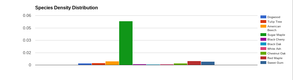
The “Investigating Forest Succession” lab instructed our group to study an area of a forest that was fifteen feet wide and two-hundred feet long. We were then to record each tree found, their species, and which stage they were in their life: sapling, young, adult, mature, old, or over-mature. Due to the fact that we became short on time, we used data previously collected from a forest plot in New Jersey with the same requirements we needed to further complete this lab. After reviewing the data, my group and I had to input it into a Google Sheets document. We then used Google Sheets to calculate the total tree density, the density of each species, and the percentage of each species at each age. Following this, we made graphs to better display the data. All of our data is shown below:


Our data shows that the forest is going through a substantial change due to succession. Since we were unable to survey the area directly due to time constraints, we are unsure as to why the forest is going through succession; some possibilities include forest fires or other types of natural disasters. My group is quite confident in our data given it was collected by professionals in the field and we were very careful when making our calculations. Through our data, we were able to conclude that trees such as Sweet Gum and Chestnut Oak have lived on this plot of land for an extended period of time given the high number of mature and overmature trees. Likewise, we were able to conclude that trees such as American Beech, Sugar Maple, and Red Maple are slowly making their way onto this plot of land given the high number of samplings and young trees. Our data suggests that high concentrations of trees such as Sweet Gum and Chestnut Oak inhabited this plot centuries ago. Our data also leads us to believe that high concentrations of trees such as American Beech, Sugar Maple, and Red Maple will inhabit this plot in the future.
Subscribe to:
Posts (Atom)